A Rainbow Bright Caper Quilt
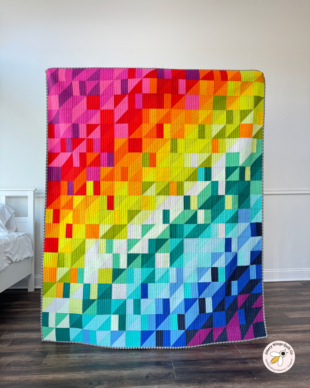
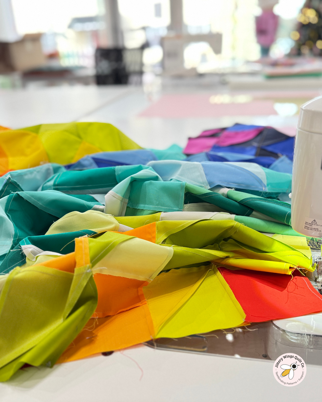
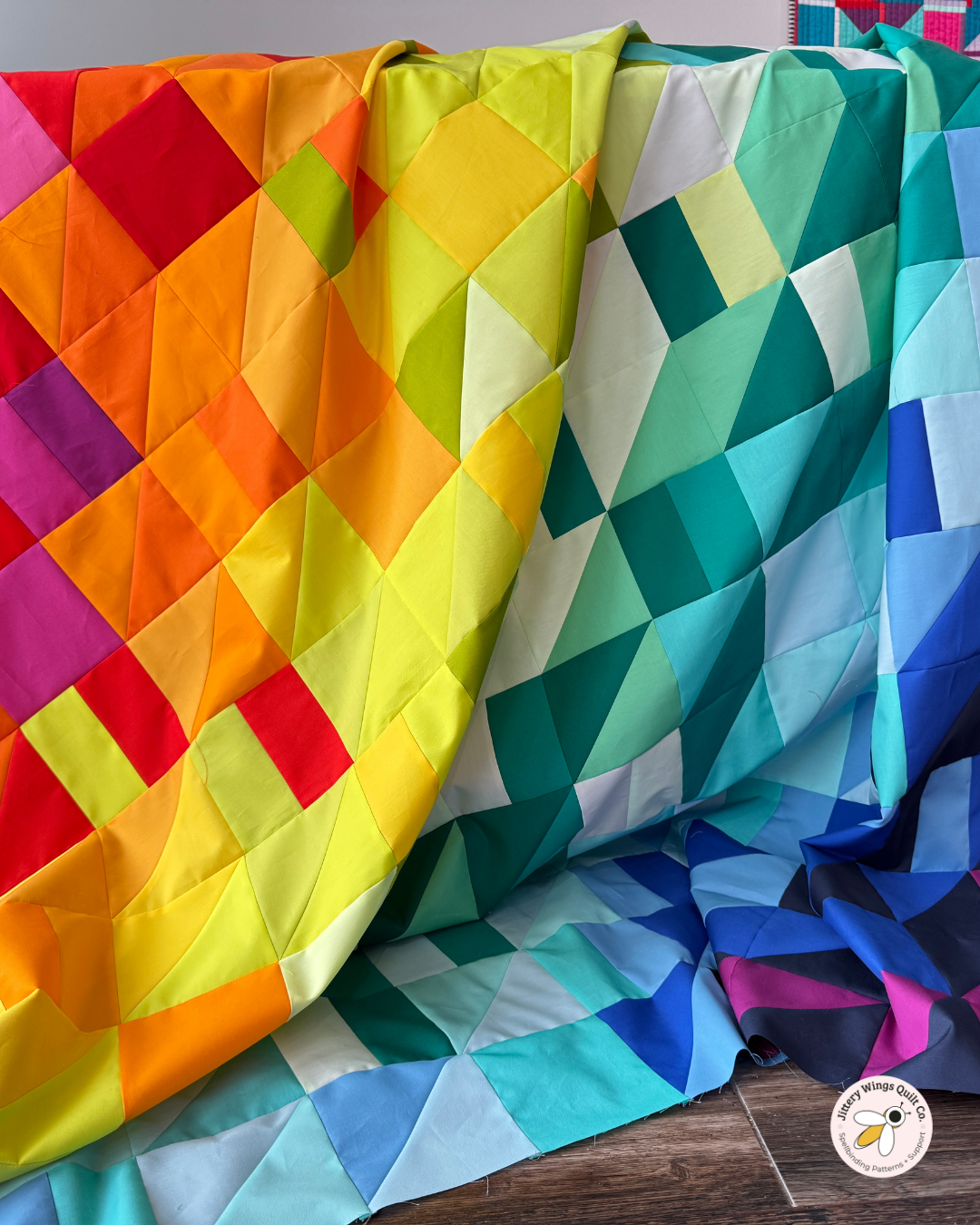
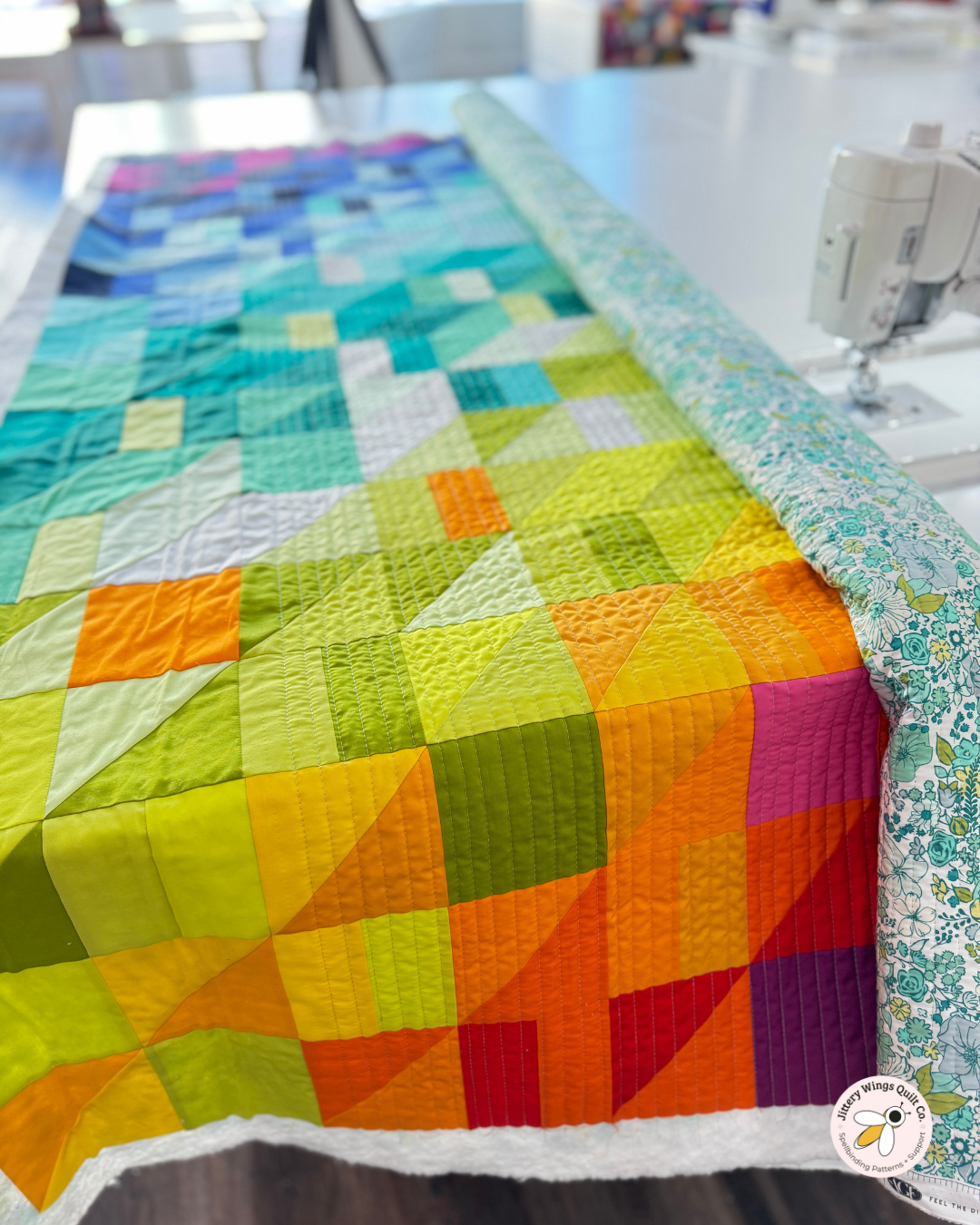
The Rainbow Bright version of the Caper Quilt Pattern is pure color joy. This quilt was made using Bundle No. 27, one of my brightest, boldest rainbow bundles, and it’s a perfect example of how intentional color flow can turn a simple block into a quilt full of movement, rhythm, and energy.
In this post, I’m walking you through how this quilt came together—from fabric choices to quilting decisions—so you can better understand the why behind each step and imagine how you might create your own version.
About the Caper Quilt Pattern
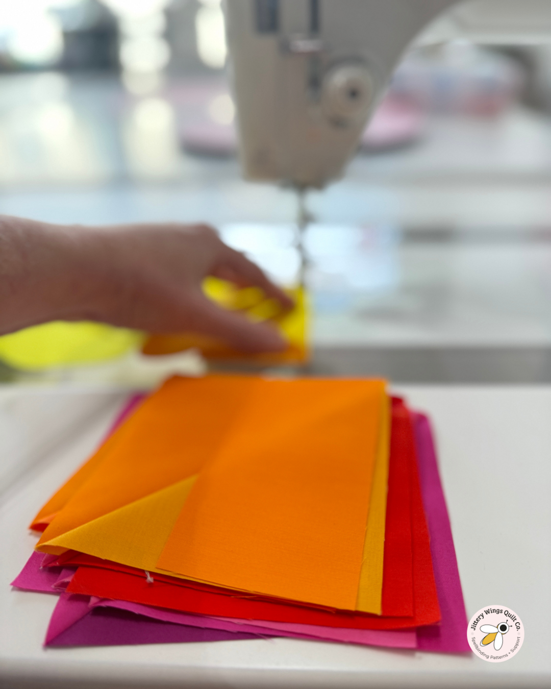
Caper is designed to feel playful and flexible. The pattern creates movement without requiring complicated piecing, making it a great choice if you want a quilt that looks dynamic but still feels approachable at the machine.
This pattern is especially well-suited for curated bundles, because the structure lets color do the heavy lifting. When the colors are ordered intentionally, the quilt comes alive without needing busy prints or extra piecing tricks.
Design Features to Notice
What makes Caper shine is how it balances structure and spontaneity. The repeated units give the quilt a strong backbone, while color placement creates the sense of motion across the surface.
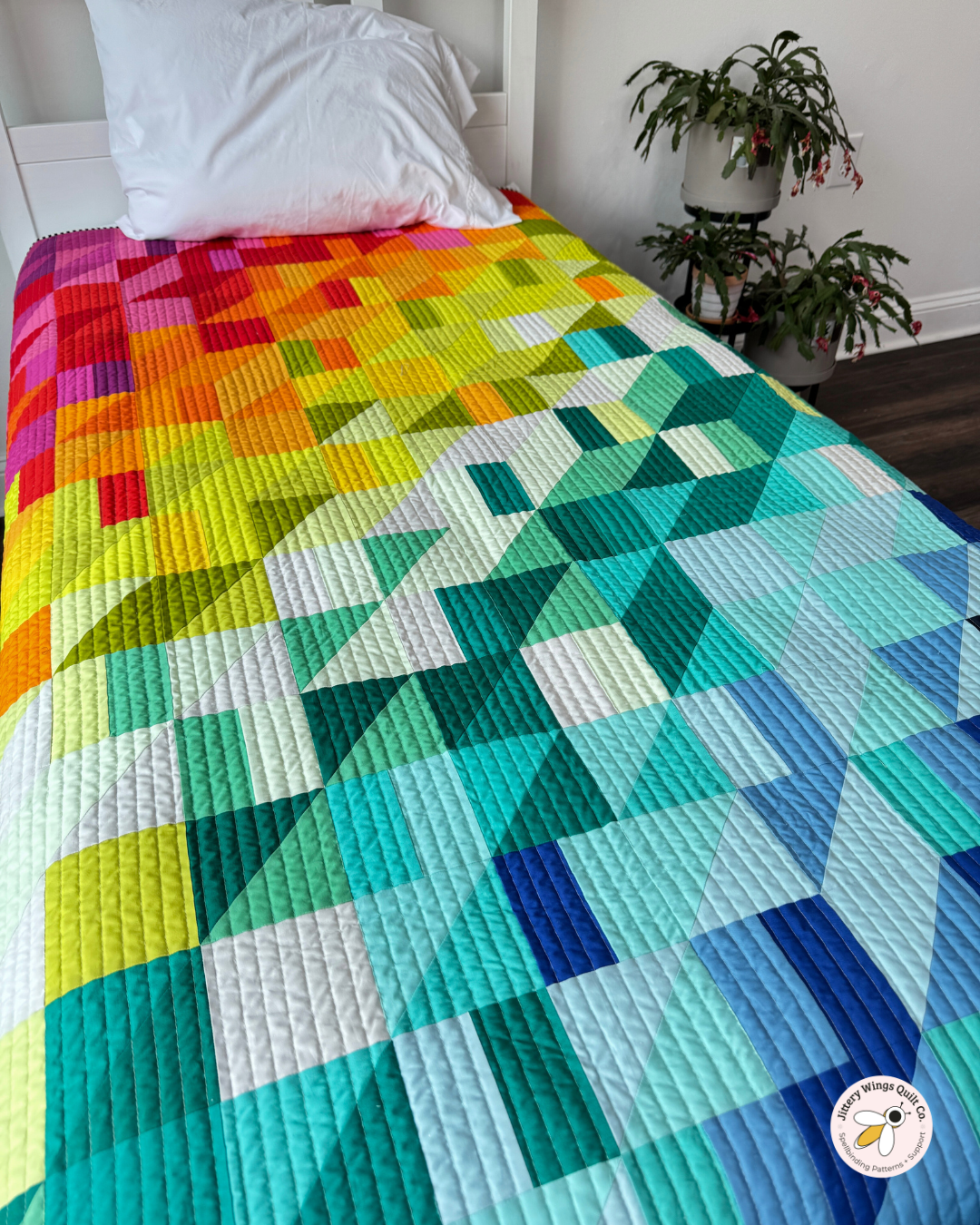
In this Rainbow Bright version, the high-saturation colors move deliberately through the quilt rather than appearing randomly. That flow is what keeps the quilt feeling energetic instead of chaotic—and it’s one of the core ideas behind how I teach color flow.
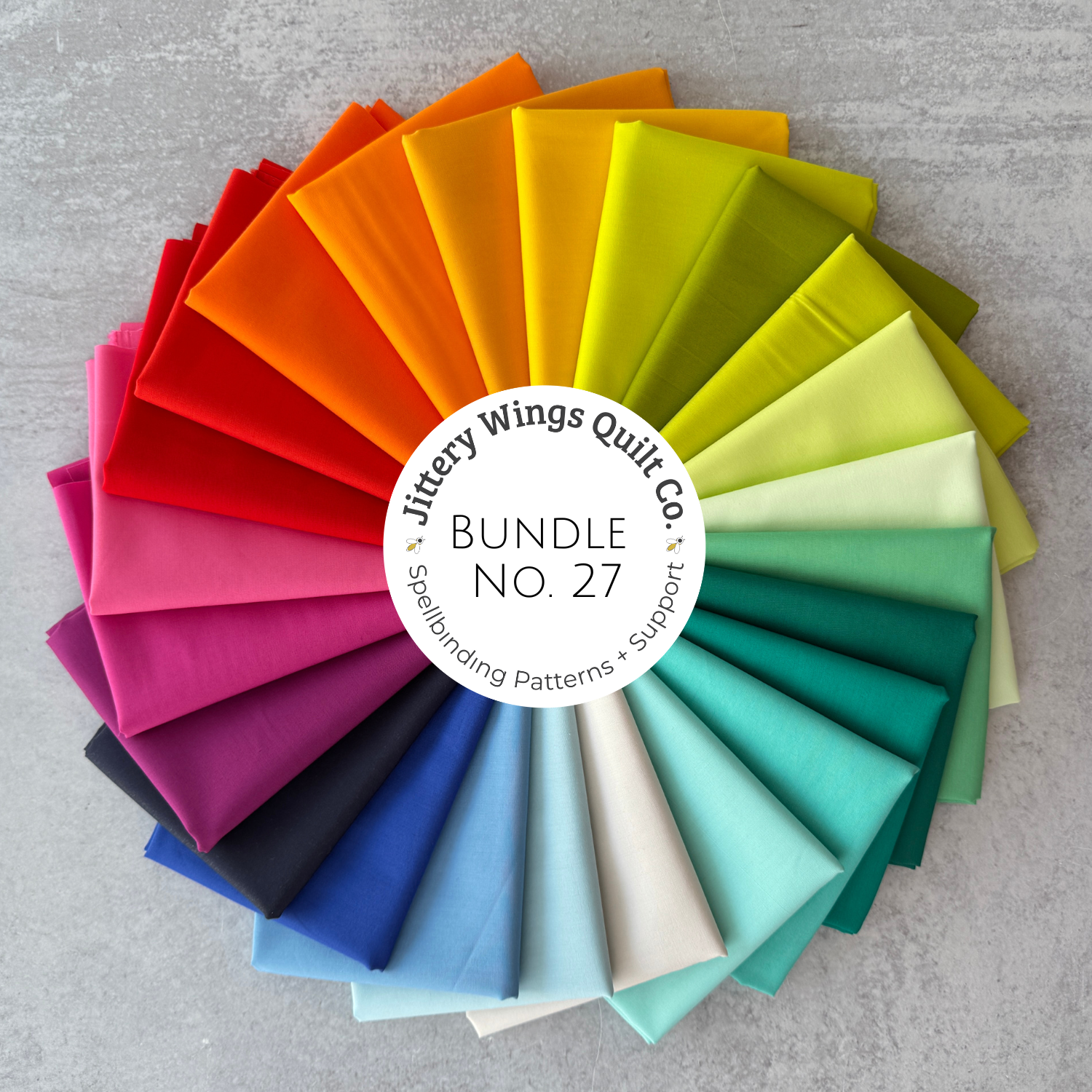
This curated Bundle by Mitzie Schafer from Jittery Wings Quilt Co. is only available here. It works for most of her controlled improv patterns, such as All the Good, Caper, Cosmic Sass, Silas Pew, Gingham Meadow, Pursuit, and Cosmic Sass. She curated them specifically for quilters who want to make those patterns.
Fat Quarter Total: 24
Fabric by: Art Gallery Fabrics
Bundle Type: Pure Solids
Availability: Until supplies last
It will ship in 1-3 business days.
Note about Fat Quarters: A fat quarter is cut by dividing a yard of fabrics into quarters. Depending on the manufacturer’s width of fabric (usually 42” to 44”), a Fat Quarter measures approximately 18” x 21”.
Note about Exact Fabrics: From time to time, depending on availability from the manufacturer, we may substitute a color or two. The feel of the palette will not change, and the fabrics will be from the same manufacturer.
We strive to keep all Art Gallery Pure Solids in stock.
These bundles are exclusive to Jittery Wings. Outside the US? We partner with Cow and Giraffe for international shipping if you are outside the US.
Here’s a list of colors if you need to order more:
PE476 - Purple Wine
PE475 - Very Berry
PE404 - Festival Fuchsia
PE537 - Undeniably Red
PE490 - Ruby
PE406 - Burnt Orange
PE520 - Sweet Tangerine
PE514 - Summer Sun
PE448 - Canary
PE578 - Electric Lime
PE554 - Parrot
PE416 - Lemonade
PE409 - Light Citron
PE528 - Celestial
PE443 - Sweet Mint
PE478 - Jade Cream
PE527 - Peacock
PE526 - Secret lagoon
PE424 - Mirage Blue
PE403 - Fresh Water
PE434 - Tranquil Waters
PE477 - Aero Blue
PE455 - Royal Cobalt
PE498 - Heart of the Ocean
About the Fabrics Used
For this version, I used Bundle No. 27, a very bright rainbow bundle with high contrast and clear color separation. This bundle is ideal if you love bold quilts that feel modern, cheerful, and unapologetically colorful.
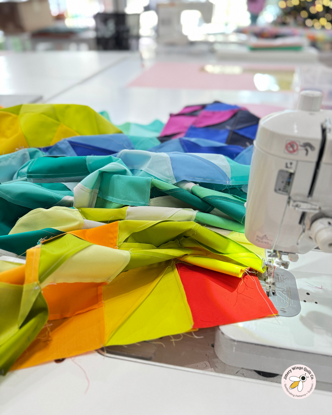
Because the bundle already contains a thoughtful range of hues and values, the design process becomes less about choosing colors and more about arranging them—one of my favorite ways to quilt.
The Backing Fabric Choice
I backed this quilt with Art Gallery Fabrics Bloomcore in blue, which was a deliberate choice to calm and ground the brightness on the front.
Using a printed fabric backing with a rainbow quilt gives me a place to really show off the prints I love without using them in the quilt top.
Binding Details (My Favorite Stripy Binding)
The binding is my go-to black-and-white stripe, and I reach for it often—especially with bright quilts like this one.
A striped binding frames the quilt without pulling attention away from the color story. The black adds definition, the white keeps it playful, and the stripe introduces just enough graphic interest to finish the quilt cleanly.
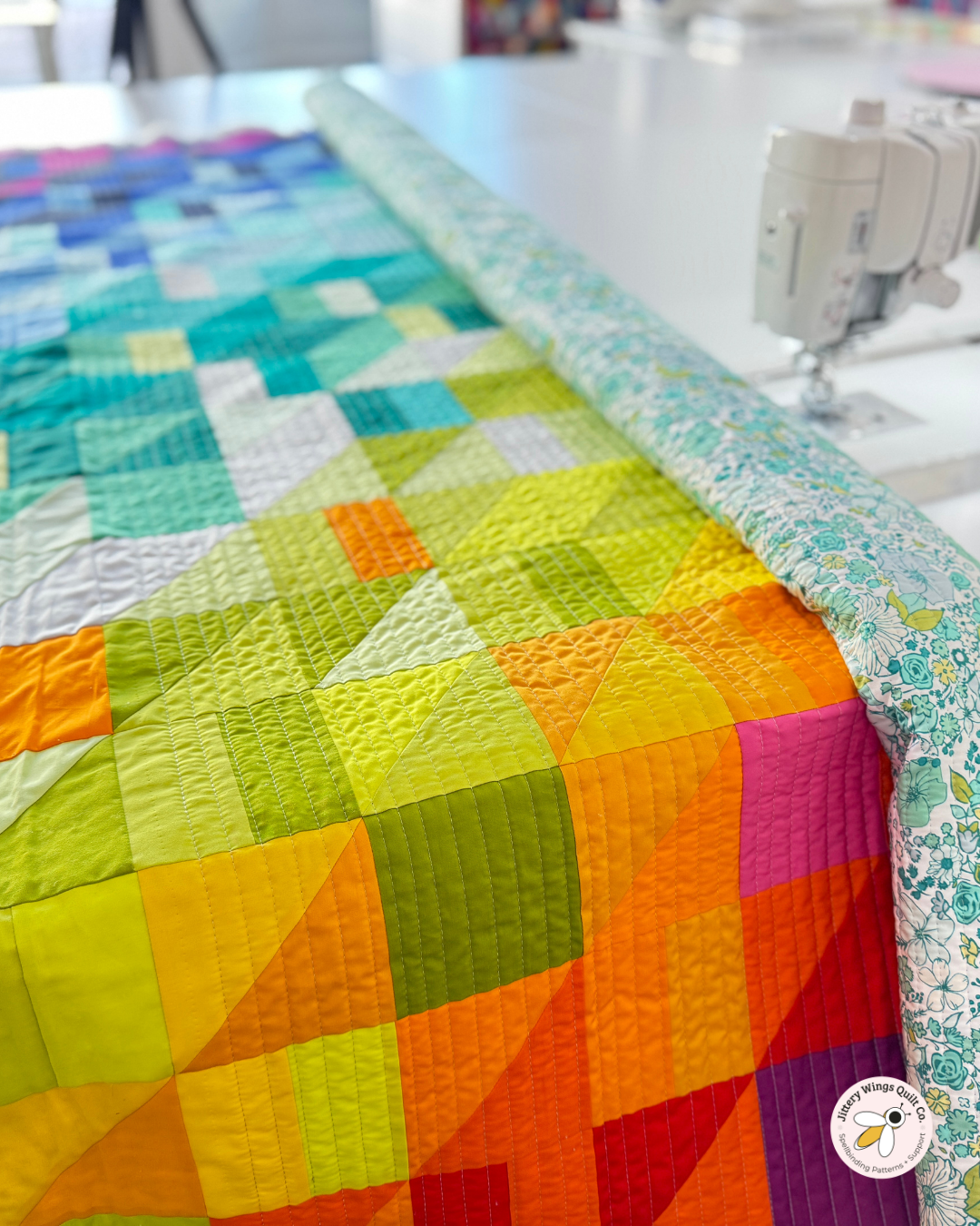
How I Quilted This Version
This quilt is finished with straight-line quilting, spaced ½" apart.
Straight-line quilting is one of my favorite options for modern quilts because it reinforces structure while letting color stay center stage. The close spacing adds texture without overpowering the piecing, and it’s approachable whether you’re quilting on a domestic machine or sending it out to be long-armed.
I used this neutral thread to keep the quilting subtle and cohesive across the full range of colors.